Hello, Happy Readers! Apologies for the long time, no blog. I’m excited to break the incommunicado streak (Jimmy Buffett earworm, anyone?) and let you know it’s in a good cause and there are cool things on the very near horizon. I’m wiggling in my chair just thinking about it. And not in the way dingbat dog Mr. Dribbles (aka Travis) wiggles by the door. If you’re a Newsletter subscriber, be sure to check your Inbox this weekend. And if you’re not, why aren’t you? 😉

congerdesign / Pixabay
With that tease out of the way, I thought I’d share the latest in Prodigal’s Perfect Paperback Peregrinations. (Disclaimer: I did right-click on my Thesaurus for an alliterative “P” journeying word, and I do not regret it—what an awesome specimen.) I mentioned recently that I’m working on getting the Prodigal paperback into wider distribution. Eventually, I’ll go back and do this with the Sydney Brennan books as well. Every time you submit a book to a distributor (like Createspace or IngramSpark), you have to do a Proof to make sure the pages aren’t somehow upside down and in Farsi. This can be done electronically, or with a physical copy, or both. Being slightly anal and/or paranoid, I do both. Crazy things get lost in translation from Scrivener or MS Word to pdf (or often just from Word to Word-five-minutes-later; I’m not a big fan of Word). This even happened when I paid someone to format the Prodigal paperback for me—simply opening the file on my computer was enough to break it. :p
A couple of months ago, the program I now use to format ebooks added print book formatting. And the angels sang!! I used it to painlessly prepare Prodigal for the new distributor, and also replaced the old version on Createspace so they’d look the same inside. That meant ordering another proof. So let’s start the Prodigal Proof Counter, shall we? #1: the original Createspace version; #2: the original IngramSpark version; #3: the updated Createspace version… But I’m not done yet. Less than twenty-four hours after ordering the IngramSpark proof, I realized I’d used the wrong cover file (right book, just not the biggest file), had to replace the cover file, and order #4: the revised IngramSpark version.
Phew! I’m leaving out all the hair-tearing details (like, will my cover still fit) because I know many of you don’t read horror stories. But I have to note that someone charges a minimum of $40 (?!?!) to ship a single book to Hawaii unless you use Media Mail. For those of you who don’t live on a Pacific Island, Media Mail means they put it on a canoe, or strap it to a whale during humpback season. In other words, I went Media (still got overcharged) and the proof with the wrong cover arrived yesterday, three weeks after I ordered it. The proper version is presumably still paddling across the Pacific.
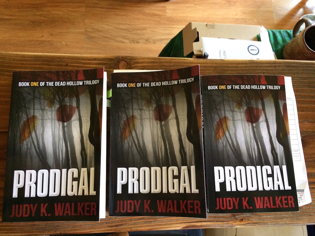
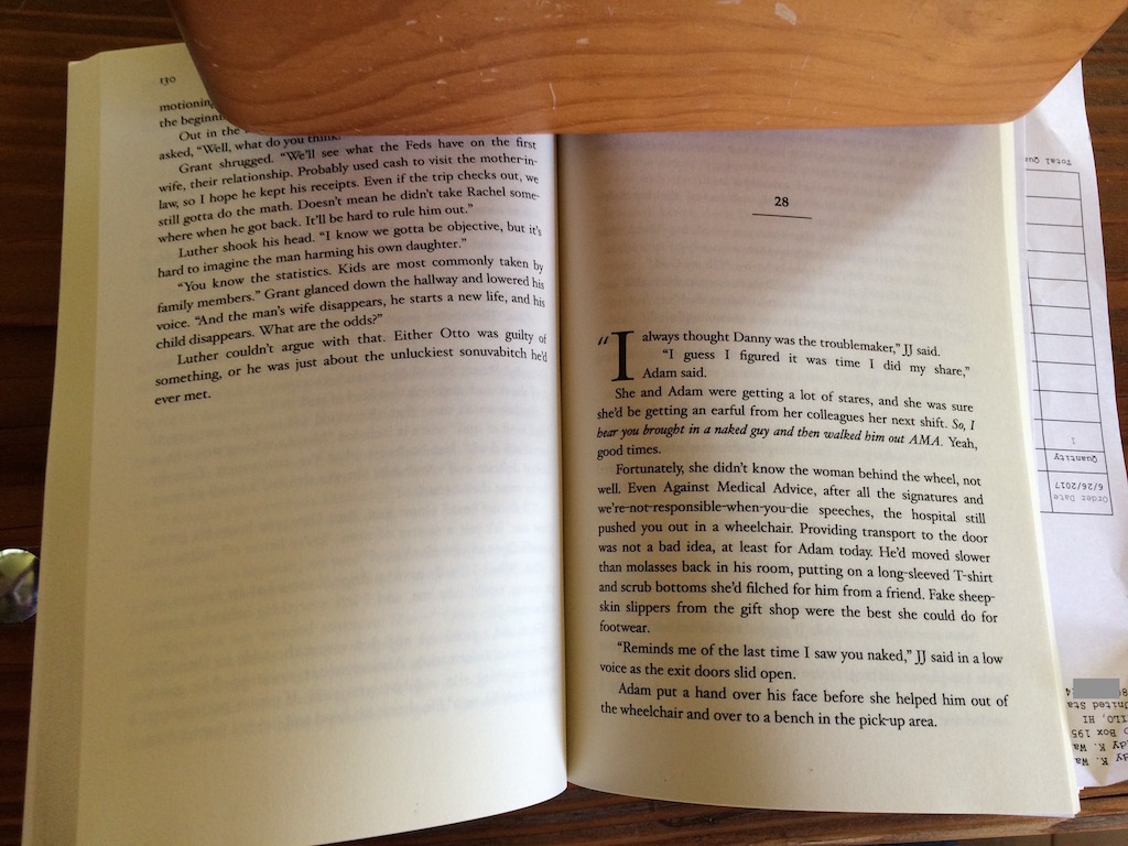
What do these different versions mean for you, the reader? Honestly, not much. But theoretically, your paperback may look slightly different if you order from, say, Amazon versus Barnes & Noble. People argue which distributor has the better print quality (and if they’re even printed in different places; it depends on where you live). I’m sharing photos below so you can decide for yourself. One-handed photos with an iPhone and a yoga brick, so don’t be expecting Nat Geo quality.
The covers of the Ingram Spark and the Createspace proofs look slightly different to me, but I’ve used the tape measure and cannot find any measurable difference. They have the same number of pages, but the IngramSpark book uses thinner paper so the spine is slightly skinnier. The printed words inside the IngramSpark book are also noticeably darker. Is the reading experience any different? I’ll have to get back to you on that. Maybe I’ll alternate chapters as I re-read Prodigal in preparation for publishing…next time, the Dead Hollow Book Two cover reveal! Mwah-ha-hah!
-

- The original version of the Prodigal CreateSpace paperback, published March 2017
-
- The updated Createspace paperback
-

- The IngramSpark paperback (with the wrong cover file)
-

- The CS1, CS2, and IS paperback covers… just waiting for No. 4!